Home Page
This is your homepage. You will want to ensure it is inviting and useful. This is your audience’s first impression of you and your site, so keep it clean and concise. You will want to personalize this page. Take this opportunity to welcome your visitors and introduce yourself. Make it fun! If you’re comfortable, create a “talking head” video or an audio file, but no worries, written text is also great. If using an audio file or text, consider adding a profile picture. The goal here is to let visitors get to know you!
Next, state your site’s purpose. If your ePortfolio (wait, what is this?) is designed primarily for in-course or program use (assessment item) add a paragraph describing the assessment’s criteria as this is the sites purpose. Your ePortfolio may have been requested by an admission committee as part of an application package for a graduate or post-graduate program or you may be offering it to potential employers as part of an application package. Let your visitors know why they should read more. ePortfolios are live public websites so it is important that visitors know why they should want to stay and look around. When editing this page as well as all other pages in your site, it is important to remember it is up to you to ensure the colors, fonts, icons and images suit the tone, message, audience, and purpose of your ePortfolio as you have the option to change these features.
Why choose this template for my ePortfolio?
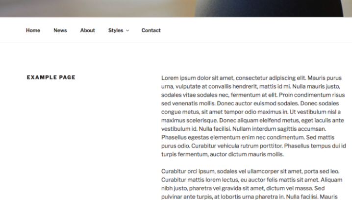
This site is using WordPress’ free Twenty Seventeen theme’s single column layout. As the template title suggests, this is a very simple and clean template. There are very few options to play with which makes it very easy to use and hard to mess up. One of the best features of this theme is that the menu floats at the top of the screen as you scroll down the page, which makes it really easy for navigation (no need to add next buttons!).
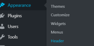
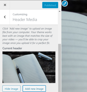
Another great feature of this theme is that you can draw your audience’s attention with a large, stunning image. How do you change it? In the dashboard, hover over “Appearance” and then click on “Header.” Now on the left, you can click on the “add new image” button to upload or select an image. After you have done so, don’t forget to click the blue “Publish” button at the top to save your changes.
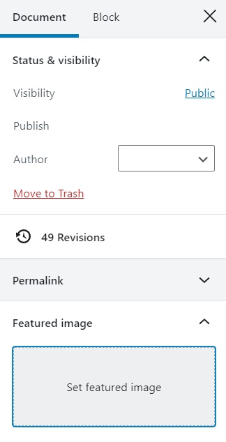
You can also add a large feature image to the top of any of your pages. When editing a page, ensure “Document” is highlighted in the right hand menu. Click on “feature image” and click on “set feature image” to upload or select an image. Don’t forget to click Update to save your changes!
Editing the Site Title & Tagline
First you’re going to want to update the site’s title and tagline. To do this go to the dashboard and click the Settings menu option, then if necessary click the General link underneath or hover your cursor over the Settings menu option and click the General link in the fly-out menu.
Take note of the Site Title field. This is where you can update the site’s title. This does not change the URL to the site. Once a site is created you cannot change it’s URL.
Next, update the Tagline field and click Save changes. If you do not want a tagline simply delete the place holder text and leave the field empty, don’t forget to click Save Changes.
While you are here take notice of the Writing link under General. This is where you can control whether or not emoticons convert to graphics, change the default post category and switch the default editor. If you switch the default editor we recommend you allow users to switch editors. If you choose to reuse one of the templates pages and want to keep it’s layout you will need to use the block editor rather than the classic editor.

Theme Options
You can select whether you would like to display one column or two on your page. However, two columns doesn’t actually mean two content columns. The title of your page just shifts to the left and your content shifts to the right.
